DaisyUI v5 Component Library Showcase
Every DaisyUI v5 component is available in this build. Use this page to QA visuals, states, and theme integration without leaving the lander environment.
Action Components
Buttons, dropdowns, modals, and other interactive primitives powered by DaisyUI.
Buttons & Sizes
Button Group & Join
Dropdown & Context Menu
Modal & Dialog
Static preview of a DaisyUI modal. The wrapper retains modal styling without blocking the page.
DaisyUI Modal
This modal uses the native <dialog> markup pattern styled by DaisyUI.
Swap & Toggles
Swap, toggle, checkbox, and radio interactions rendered with DaisyUI styles.
Data Input Components
Form elements, ratings, ranges, and other user input primitives.
Form Controls
Ranges & Rating
Data Display Components
Alerts, cards, stats, tables, timelines, and other presentation helpers.
Alerts & Toast
Avatar & Badges
Cards & Carousel
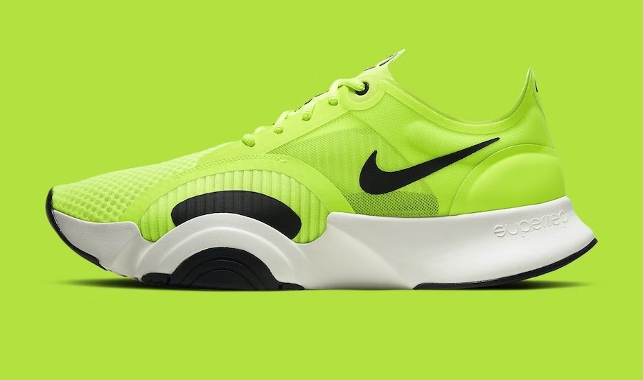
Shoes
Pick your perfect pair for the season.
Collapse & Timeline
Use collapse for FAQs, accordions, or onboarding checklists.
- Kickoff1Gather requirements
-
Build2Implement & test
-
Launch3Ship to production
Progress & Countdown
Table & Chat
| Name | Role | Status |
|---|---|---|
| Ada Lovelace | Engineer | Active |
| Alan Turing | Researcher | Away |
| Grace Hopper | Scientist | Review |
Layout Components
Artboards, drawers, indicators, masks, stacks, and dividers for structural layouts.
Artboard & Divider
Drawer
The drawer component is perfect for mobile navigation and dashboards.
Indicator & Stack
Masks
Navigation Components
Breadcrumbs, menus, navbars, tabs, pagination, bottom navigation, and steps.
Breadcrumbs & Pagination
Menu & Navbar
Bottom Navigation
Mockup Components
Window, browser, phone, and code mockups styled with DaisyUI.
Window & Browser
Use the browser mockup for marketing screenshots or modal previews.
Phone & Code
const message = "Welcome to DaisyUI v5!";
Implementation Notes
✅ Prefix consistency: every sample uses the dui- prefix configured in Tailwind.
✅ Layout wrappers: sections render inside page-gutter → container-measure for perfect alignment.
✅ Fully server-rendered: no additional client JavaScript is required for these components.
✅ Ready for QA: use this page to visually test theming, RTL, density, and responsive breakpoints.