DaisyUI v5 Components
Reference implementation matching daisyui.com proportions - no extra utility padding
Buttons
Button Variants
Button Sizes
Card
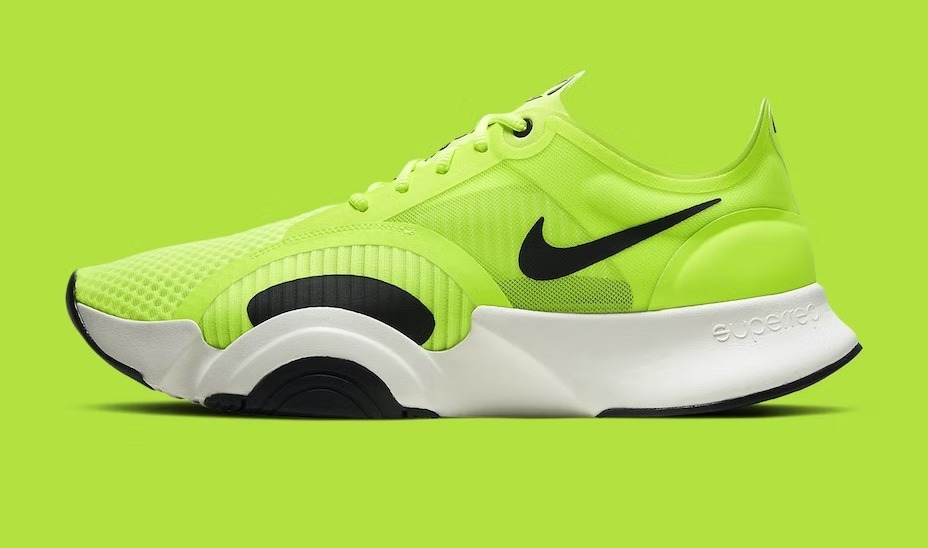
Shoes!
If a dog chews shoes whose shoes does he choose?
Badge
Badge Colors
neutral
primary
secondary
accent
ghost
Badge Sizes
987,654
987,654
987,654
987,654
Alert
New software update available.
Your purchase has been confirmed!
Warning: Invalid email address!
Error! Task failed successfully.
Tooltip
Tooltip Positions
Menu
Vertical Menu
Horizontal Menu
Navbar
Navbar Example
Footer
Footer Example
Stats
Total Likes
25.6K
21% more than last month
Page Views
2.6M
21% more than last month

86%
Tasks done
31 tasks remaining
Status
Status Indicators
Online
Away
Offline
Indicator
Indicator Examples
99+
content
new
content
99+
content
Implementation Notes
✅ No Extra Padding: All components use DaisyUI's built-in spacing. No additional utility padding classes needed.
✅ Prefix Consistency: All DaisyUI classes use the dui- prefix to avoid conflicts.
✅ Layout Integration: Components work seamlessly within our layout primitives (page-gutter, container-measure, section).
✅ Performance: Total CSS bundle stays within 45KB budget with full component library.